Highlights Website
This case study focuses on the initiative at Highlights magazine to unify and update their main websites for kids, parents, teachers, and products/sales into a single, cohesive website.
The goal was to provide a seamless and engaging user experience for children, parents, and teachers while simplifying the shopping process for Highlights products. This case study outlines the key steps and strategies employed to achieve this vision.
Key Objectives:
- Unify and Simplify: Merge multiple websites into a single, intuitive platform while maintaining distinct content areas for kids, parents, and teachers.
- Enhance User Experience: Design a website that aligns with the mental models of users and facilitates easy access to content and products.

Success of this project is characterized by a user-centric approach that not only defines the desired customer experiences but also ensures that the final design aligns with the mental models of the key user segments. Ultimately, it is about delivering a website that effortlessly facilitates access and engagement with Highlights content, enriching the experiences of kids, parents, and teachers while also serving as an effective sales platform.
Approach:
1. User Persona Development:
- Conducted user research to understand behavioural patterns, attitudes, motivations, and goals of the target audience.
- Used this research to create detailed user personas representing the different user segments: kids, parents, and teachers.
- These personas informed the future design by providing insights into user preferences and needs.

2. Mental Model Diagram:
- Developed a visual representation of the ideal website's mental model based on data driven insights. Mapped out the main content areas, their relationships to each other, and the types of content within these areas.
- This diagram served as a reference point for the design and ensured that the website structure was aligned with user expectations.

3. Split View Organizational Structure:
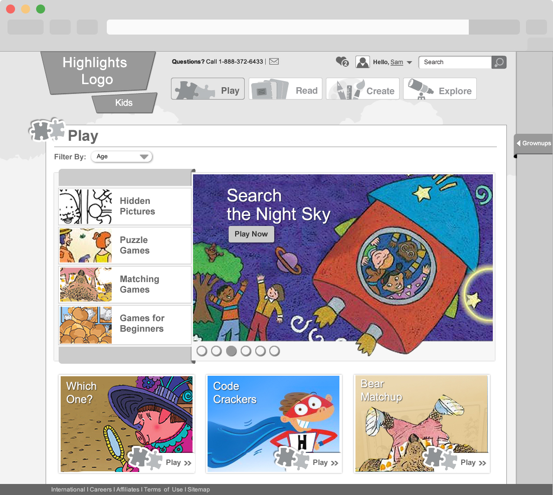
- Recognized that Highlights.com needed an overall structure that catered to different user groups, particularly kids and grownups.
- Designed a split-screen structure where grownup and kids content coexisted.
- This split view allowed users to easily identify and access content tailored to their age group from the home page, simplifying navigation.

4. User-Centric Design and Prototype Development:
- Collaborated closely with designers to translate the mental model and user persona insights into a user-centric design.
- Focused on creating an engaging and easy-to-navigate website, ensuring that content was readily available to the right audience.
- Developed interactive prototypes to test the website's usability and gather feedback.
- Iteratively refined the design based on user testing and feedback from all user segments.

Conclusion:
Through a structured approach that included defining customer experiences, creating user personas, designing a mental model, and implementing a split-view organizational structure, I successfully unified and updated the Highlights website. This case study highlights me journey from research and ideation of a user-centric, unified website that caters to the needs of kids, parents, and teachers.


 TRACK // TEACH // TRAIN >